Quote Implementation 1
Quote Implementation 2
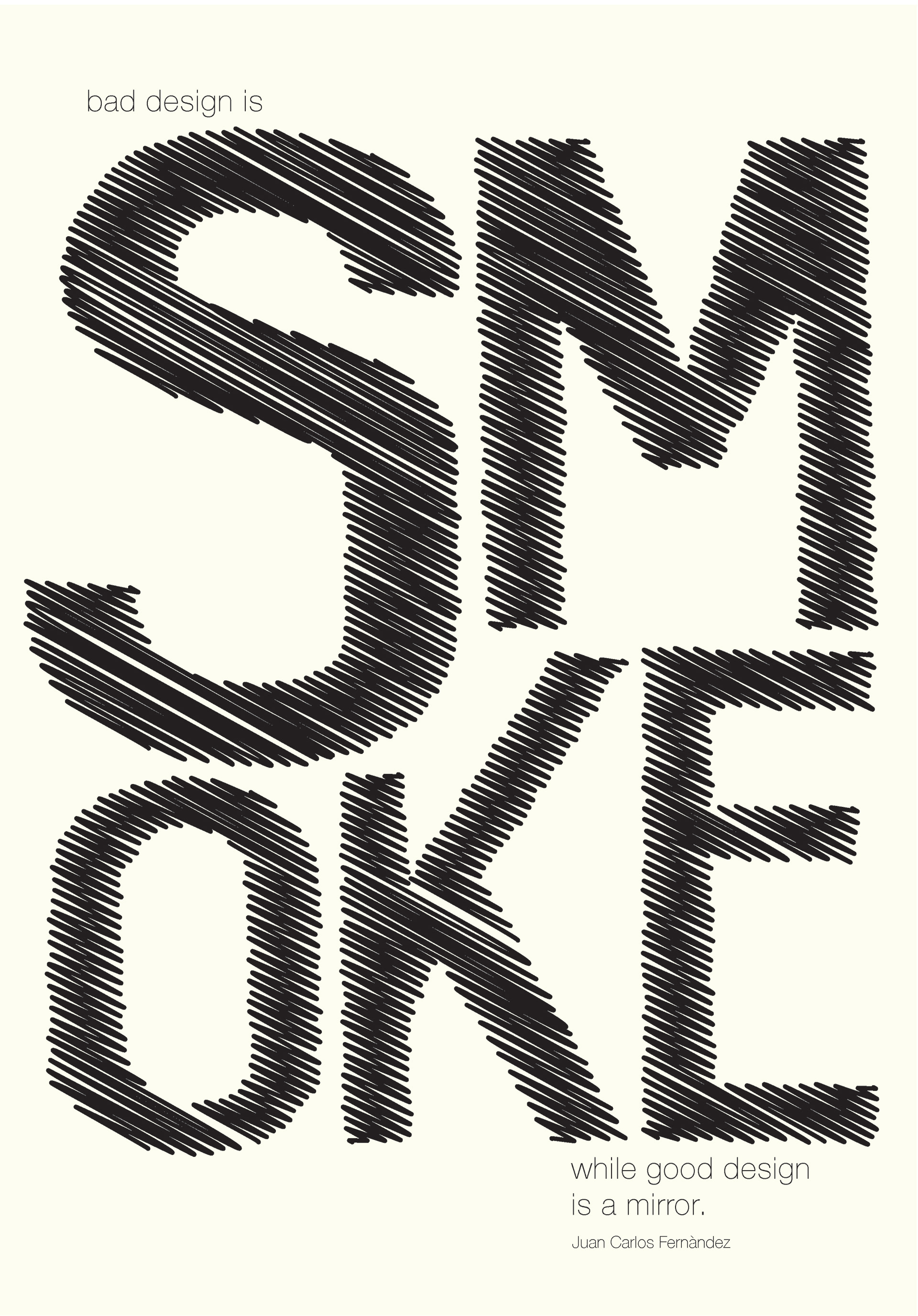
For the design on the right, I wanted to try something that fully emphasized the word “smoke” while making the rest of the design much for subtle. I also purposefully wanted the first part of the quote (“bad design is smoke”) to be a little bit unclear unless you take a second glance at it. This is why I added the blur effect and the scribble effect on this part of the quote, while “good design is a mirror” is very straight-forward
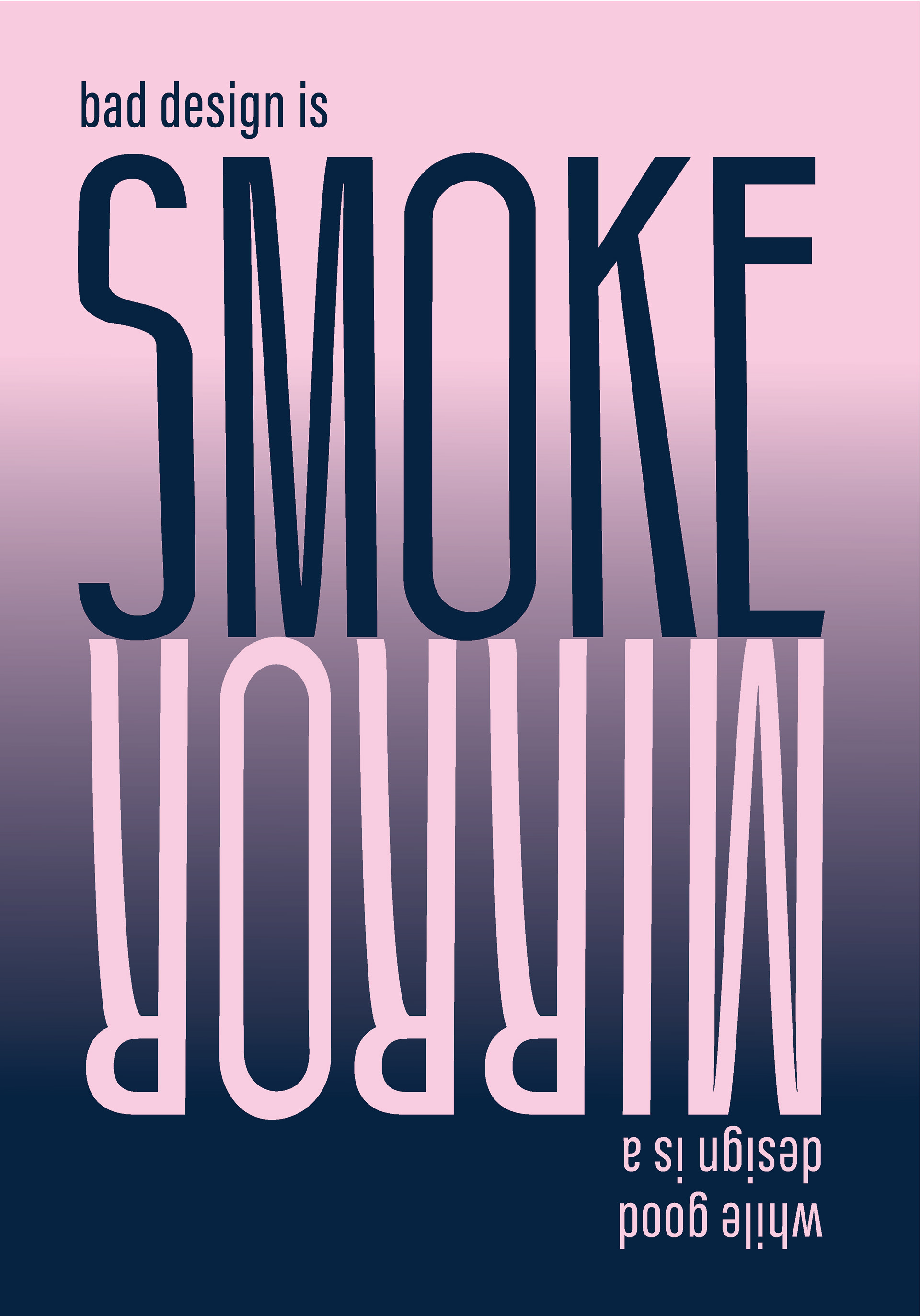
I wanted to experiment with the idea of a reflection for the left design as well, but in a much different way than my Design Three option. The idea was to get the two parts of the quote to perfectly mirror each other, despite being different words. Since these are prints, I wanted the viewer to be able to flip the page around and get a different effect on which side was easier and which was more challenging to read. I had several different color options but ended up with this variation because it felt far more smokey and mystique than the other variation.
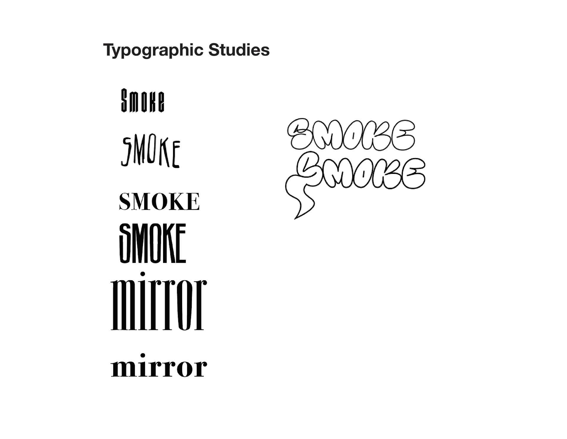
Typographic Studies